Our interactive Student Choice page uses HWDC data and data from the Bureau of Labor Statistics to help students begin thinking about health careers and education. This tool highlights the interoperability of HWDC data and how it can be used in analysis and decision making.

Whether you enjoy a challenge, working with people, or uplifting your community, there are plenty of reasons to pursue a career in healthcare. Here at the Healthcare Workforce Data Center, we’d like to add another reason: economics.
According to the latest HWDC estimates, workers in Virginia’s healthcare and social assistance industry earned on average $82,387 including about $69,000 in salary & wages and $13,000 in benefits. Workers willing to advance their education can earn substantially more. Healthcare also offers stable employment and strong job growth prospects. The US Bureau of Labor Statistics predicts that healthcare and social assistance will account for almost a third of job growth between 2022 and 2032. An aging population of baby boomers will ensure that growth continues for decades to come.
Add to that high job satisfaction rates—our surveys show that well over 90% of health professionals are satisfied with their current employment situation - and it is easy to see why health care careers make up 40% of USA Today’s 100 Best Jobs, including 4 of the top ten.
The following charts will help you get started on choosing a healthcare career by looking at the professions we currently survey. This should get you started on considering a health career. For a broader look at the health careers available, see the Virginia Healthcare Workforce Development Authority’s Healthcare Careers guide.
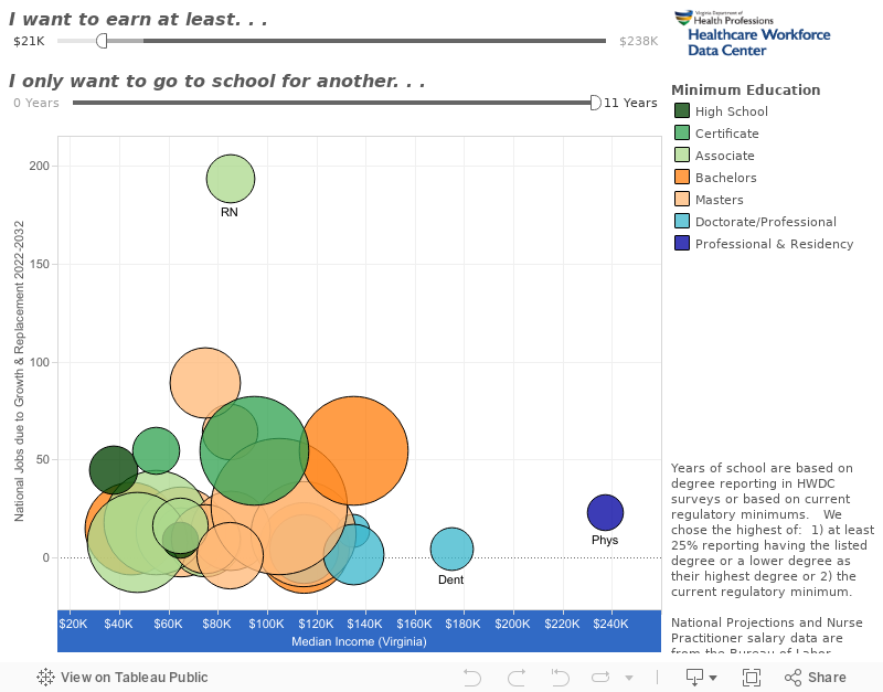
A good career should have a good balance between your interests, job prospects, potential earnings and the cost of education in time and money. Professions near the top of this chart have the highest projected job growth, while those furthest to the right earn the highest median income. Circles are sized by the average number of annual job openings expected between 2022-33 and colored by minimum degree. The years of education listed are “typical” for the degree. Accelerated programs may be available for some students. Some specialties may require additional education. Hover your mouse over the circles to see the profession and detailed information. Salaries are median only.
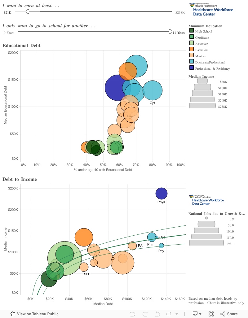
Additional years in school aren’t the only cost to education. College is expensive and many students take out loans to pay for it. Although your own educational debt levels depend on many factors, including parent’s contribution, work/study, type of school, tuition rates, scholarships, etc., the chart below gives a rough guide to how much debt students are taking on to achieve these careers. The first one shows median debt compared to the proportion of practitioners under age 40 with debt. The closer each profession is to the top, right corner, the more debt the under 40 workforce had to take on. Circles are sized by income.
As you might expect, educational debt load closely corresponds to degree type. The one major exception is physicians: both the median debt and the proportion of physicians under 40 owing education debt are lower than you might expect from looking at the chart. This is where income (circle size) comes in. Physicians tend to earn more than other professionals and may be better able to pay down their educational debt.
The next chart makes this point clear. By plotting median income with median debt, a trend emerges: more educational debt, corresponding to higher degrees, results in higher incomes. But something else is apparent too. As the trend lines show, income rises quickly with smaller amounts of debt but then appears to taper off. This is a phenomenon economists call “the law of diminishing returns”. What it means for you is that there is no need to obsess about being an educational overachiever. There are many good jobs in healthcare available to those with two-, four-, or six-year degrees. But those who do decide to pursue doctoral degrees or medical school will be rewarded with more disposable income, which they can turn into investment or pay down their educational debt early. That is why physicians have unexpectedly low debt levels.
On the flip side, it shows you likely do need some kind of degree, certificate or training after high school if you want to do things like own a home, go on vacation or purchase a new vehicle.
Of course! By simply extrapolating median earnings over an expected career ([65 years] - [years of education] - [18 years]) a registered nurse can expect to earn $1.4 million more than a licensed practical nurse while a nurse practitioner can expect to earn $1.9 million more than a registered nurse. That is even accounting for lost earnings from extra years of education. Additionally, persons with higher education levels tend to have more job opportunities and more control over their work situation.
But income isn’t everything. There are several other economic factors to consider. The rate of job growth provides an indication of how easy it is to get and keep a job. The size and flexibility of the profession also provide an indication of job availability. For instance, although the job market for audiologists is expected to grow almost twice as fast as that of registered nurses, there are only a very small number of audiology jobs available. Audiologists also tend to remain in the jobs they have, perhaps because there are so few job opportunities. Because of this, audiologists may have difficulty finding a position in an area they desire to live. Registered nurses, however, should be able to find work almost anywhere.
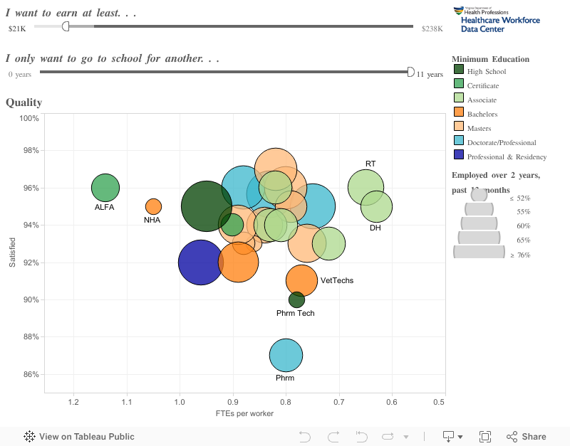
Job satisfaction and your desire for work-life balance are also important. The chart below compares the proportion of workers satisfied with their current employment situation to the average proportion of a “full-time equivalency units” provided by their members—an approximation of hours worked based on a 2,000 hour work year equaling 1 FTE. Professions closer to the top-right have higher job satisfaction and tend to work fewer hours per year. Circles are sized by the proportion of professionals employed over two-years, an indicator of job stability.
As you can see, most health professions provide both high job satisfaction and good work-life balance. Pharmacist have the lowest job satisfaction level—but almost 90% are still satisfied with their current employment situation!
We can also see the reason long-term care administrators earn more than their counterparts with similar educational backgrounds: they work more hours. Only directors of long-term care facilities need to be licensed, so only leaders in their fields are surveyed, skewing their income and other data.